Born and raised in the PNW, Yanny (pronounced yaw – knee) believes that the moody and grey atmosphere from that world has found it’s way into his photography style. Candid, raw, full of emotion, and photos that you can “feel” are what he lives for!
Yanny approaches every photo as a painting, a work of art. Even when it’s candid and off-the-cuff, it is so intentional and significant! He believes you deserve to feel seen and recall every raw emotion in your final gallery.
Hang out with Yanny on Instagram

Meet the Winston Template
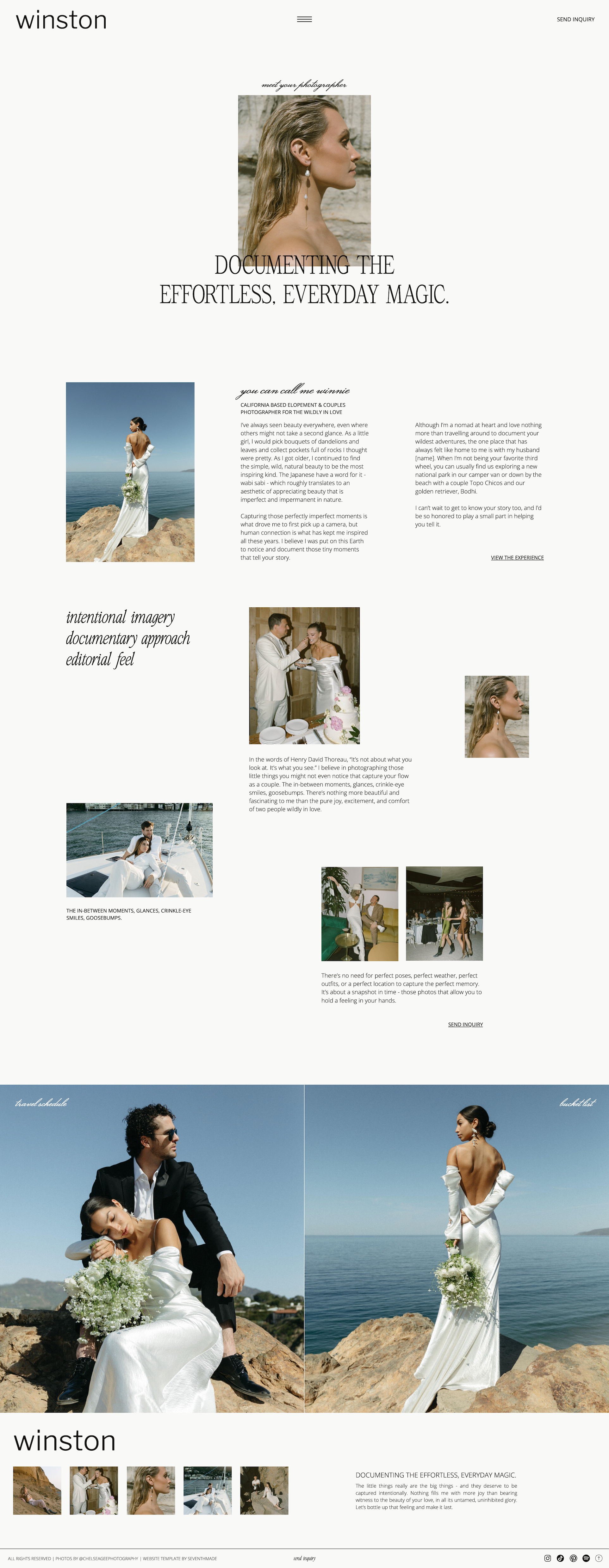
Yanny wanted his website to reflect the raw, candid beauty of his photography. The Winston template, with its playful yet sophisticated aesthetic, was the perfect match for his vision.
The Winston showit website template is all about that editorial, classic aesthetic, and with plenty of room to breathe and let your work tell the story. Each scroll through this modern-meets-vintage website will guide your dream clients through your brand and get them excited to book so you can focus on what you love.
In His Words
“I cannot say enough good things about Seventh Made and the templates they produce. Every single one crafted with such detail and care and laid out in the easiest most digestible manner you can imagine! My old website that was built off of some random e-commerce template was not designed for what I was trying to accomplish. Namely having a space that not only gives my couples and clients the information they’re looking for but also let’s me showcase my work in a way that draws people in and shows them I mean business. This isn’t your moms tumblr page, the Winston template changed the game for me, I went from having a sub-par website that you could barely say “got the job done” to a finely and artfully crafted site that is a reflection of the art and images I create. If I ever have to make another website or rebrand one day I’m coming back to them. Literally the best!” — Yanny Mishchuk
From Template to Tailored
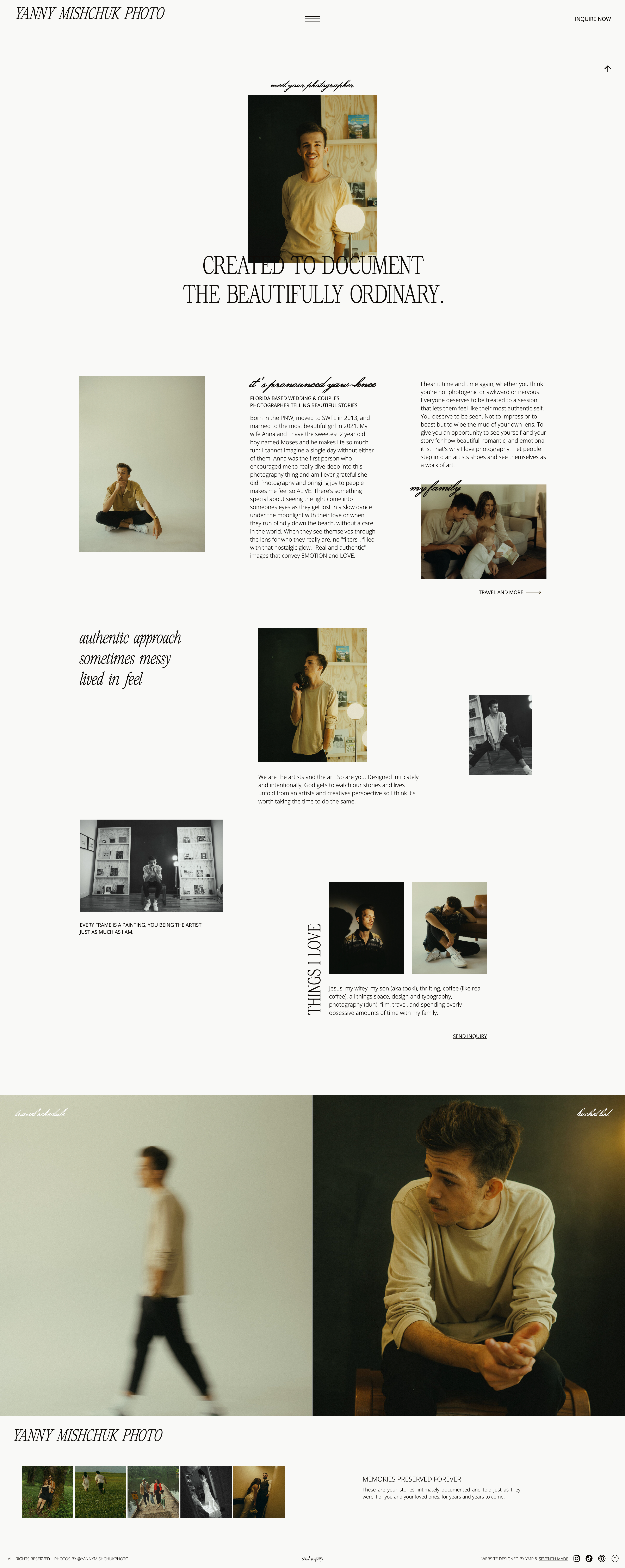
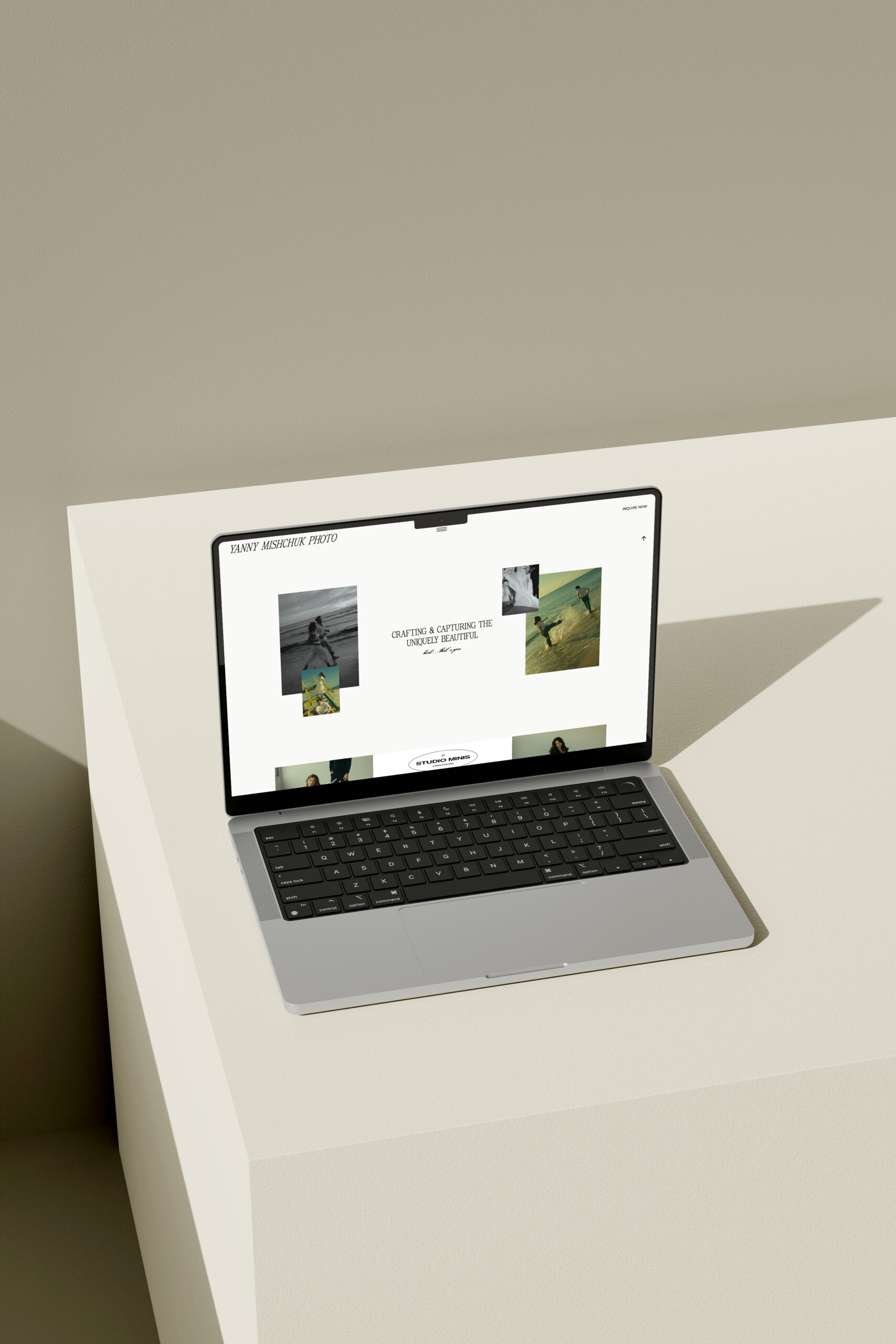
With his personal touches and customizations, Yanny transformed the Winston template into a website that’s a perfect reflection of his brand. From his signature color palette to his carefully chosen fonts, every detail showcases his unique style and dedication to his clients.
On the left, you can see the original template, and on the right, you can see how he brought the Winston template to a new level with his own beautiful work and customization. The result is a website that showcases his style, guides clients through the experience, and gives them the confidence to book


